So apparently it is British Pie Week this week, and the inevitable discussion around the office starts about ‘What is technically a pie?’ Whether a pie with a pastry top is a pie or a glorified casserole, or Mike trying to convince us that if it has ‘pie’ in the title (Shepherds Pie, Fish Pie) then it counts…
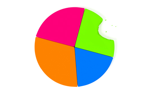
If we are playing the game of ‘pie in the name’, then I would throw in Pie charts! Ok so maybe a stretch and loosely connected to Pie Week, but as a quantitative researcher, I find myself asking is there really a place for pie charts in modern day reporting?
We are constantly challenged (by ourselves as much as clients) to provide reports that are impactful, end user focused and action oriented. Our charts need to allow users to access information quickly and intuitively, whilst at the same time being clear and engaging. We know the human brain is limited in the amount of information it can process, therefore forcing itself to filter through to the important bits. If we as researchers are doing our jobs properly, then the need for filtering should be reduced, and the risk of some key insight being missed therefore eliminated.
The rise of infographics are a classic example of how the industry has responded to the need for accessible and intuitive reporting. I’m all for infographics. They are a great way to shake up ‘boring quantitative charts’, but in the right place. If it takes longer to work out what the infographic is and what it’s trying to say, then it’s clearly not doing its job. There is nothing wrong with a good old fashioned pie chart; it is simple and communicates insight in a straightforward, proportional manner.
So when it comes to it, I’m not quite ready to give up on pie charts just yet…
By Lyn Lyons
Like this article? Follow us on LinkedIn.